Tuesday, June 16, 2009

Looking at Lolita

(1964 US LP Spoken Arts, New York)

“She was Lo, plain Lo, in the morning, standing four feet ten in one sock. She was Lola in slacks. She was Dolly at school. She was Dolores on the dotted line. But in my arms, she was always Lolita.” Vladimir Nabokov, Lolita

Nabokov's Lolita is incredibly complex and layered and poetic, but I also think it's so interesting to go back to it and consider how the cultural idea or concept of a "Lolita" differs from the actual literary one. Or many just look at all the different covers? The New Republic has a slide show tracing the covers both over time and in different countries. Here are just a couple of the ones that struck me.
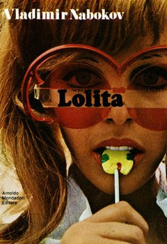
(1969 IT Mondadori, Rome (Poster))

Lots of covers with grown women (well over Lo's age) with popsicles and lollipops.

(1988 LEB Dar Al-Adab, Beirut)

Is Lolita an Alice lost in wonderland? This cover makes me think so.
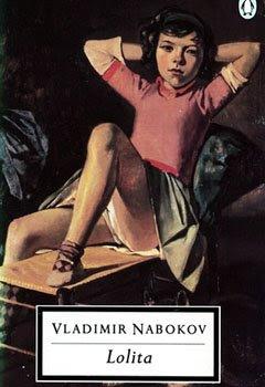
(1995 GB Penguin, London)

I love this painting by Balthus, but Nabokov had said that he didn't want to have a girl on the cover of his book. Does this one count?
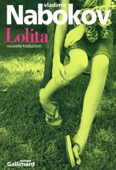
(2001 FR Gallimard (Du monde entier), Paris)

Has anyone else noticed how often books aimed at women show body parts on the cover especially legs? A couple of Lolita covers go that way too, but at least these are legs belonging to a girl (Though I think of Lolita as having scabby knees).

(2005 JAP Shinchosha, Tokyo)

I think this is a great photo. It's open to interpretation as to who is doing the looking. So many of these covers of girls/women are presented as if we're looking through Humbert Humbert's eyes. Here - it depends on the viewer on how you read the image.
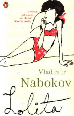
(2006 GB Penguin (Red Classics), London)

I love this image - it's cartoony and retro. I think it captures the way Nabokov mixes pop culture references in with the high literary stuff.


(1959 TUR Aydin Yayinevi, Istanbul)

This cover seems so different from the others that it may seem wrong, but I think it could read as Lolita's naive perspective on what having a love affair with a "movie star" like Humbert Humbert would look like. Or maybe that's just the English major in me over-reading this cover...

(1994 BRA Companhia das Letras, São Paulo)

Jarring and unnerving - such a thought-provoking cover. The split screen, the contrasting colors, the perspectives, the lack of words - really, really interesting.

All these cover plus more found on Covering Lolita)


Monday, June 15, 2009

Blue in the Face

The blog Smashing Color created such a neat little color game: matching names to familiar blue faces. But I also love how she assigned paint chips to those faces to really highlight the shades of difference between Smurf blue and Braveheart blue. (For the game go: here, for the answer key and color chips: here). Maggie Maggio, blogger and artist, has not only come up with 21 faces, but also also devoted a couple of posts (real blue faces, Mayan blue) to every baby boy's favorite color. I'd love to play the game with other colors - it's such a clever idea and it really shows how rich the shades of one color can be.


Saturday, June 13, 2009

summer of movies

image via patricia_poland

I love escaping into an air conditioned movie theatre in the middle of a summer day. Forget the beach, the sunshine - a cool and dark theatre and a blockbuster means summer to me. And it seems like this year there are going to be more than a fair share of releases that the film snob in me is looking forward to...

"(500) Days of Summer" with the lovely Zooey Deschanel looks incredibly cute. I want to go just for her fashion alone. But then the music (used and referenced) - the Smiths, Regina Spektor, Hall and Oats, Sid Vicious - just brings it home.


"Julie & Julia" has Meryl, Paris in the 1950s, Julia Child, Amy Adams, New York City scenes, falling down in the kitchen, writing and trying new things. I really don't think I'm expecting too much, but I am pretty giddy about this movie.


I have yet to see "Up!," but I've heard great things and am a sucker for grumpy old man stories. "Away We Go" has gotten some negative reviews, but I still think I might take a chance just for the cast alone. "Taking Woodstock" looks wonderful though and "The Time Traveler's Wife" looks a little too sentimental, but I really liked the book and one should always support films where the main character is a librarian.
It's going to be a grand summer for those of us who enjoy staying pasty and cool!

Thursday, June 11, 2009

Ahoy


Imagine launching your very own fleet! I think this would be such a great project-this photo has me so excited to try my hand at paper boats. Once my kids are bit older I bet they will love making and decorating a whole bunch of boats to set sail (at least I'm sure to love it). I imagine there are countless ways to make the boat your own, but for the vessel to actually float there are specific folding techniques involved. I found some very simple instructions....

This is perhaps a wee bit more ambitious- A German artist actually set sail on a life-sized paper boat made from tetrapack.

Image courtesy of blogs.abc.net.au

These landlocked boats are smile-worthy...no floating even necessary.


Paper boat place card courtesy of marthastewart.com


Paper boat wrapping courtesy of ohdeeoh.com


Paper art courtesy of ullabenulla

Monday, June 8, 2009

Felix Doolittle

The art of Felix Fu is magical, innocent, delicate, intricate, and it also happens to be quite miniature. His watercolor glimpses of the world around us are featured at Felix Doolittle, perhaps the most beautiful stationery company out there. They have everything - notecards that define pretty, charming birth announcements, and address labels that contain all the cheer of the holiday season on a tiny rectangle.
The website is definitely worth a stop on any browsing schedule. It is a true feast for the eyes.


Friday, June 5, 2009

Fake Plastic Trees

I started seeing it everywhere and at first I was skeptical, but eventually the concept of vinyl wall art really grew on me. As with any design element I find appealing, there are usually versions or executions I prefer more than others. In the world of vinyl art I really like the representation of natural elements (kind of ironic given we are talking plastic here) best.
The branches, the blossoms, the birds....they are just the coolest. They can bring drama or sweetness or a calming peace to a room- how many things can you say that about? Some day I'll be brave enough to try something like this in one of my rooms , but for now I'll just admire and covet from afar.


Image courtesy of LeenTheGraphicsQueen via Etsy


Image via potterybarnkids.com


Image courtesy of TastySuite via Etsy

Image courtesy of eternitywallart.com

Thursday, June 4, 2009

"All the quick children have gone inside..."

"Untitled (butterflies and shed)" by Gregory Crewdson
(found: here, uncropped version: here)

I find the following poem so haunting, and I can't even explain why. What do you think? What effect does it have on you? And doesn't the photo just capture it?

by Cecilia Woloch

All the quick children have gone inside, called

by their mothers to hurry-up-wash-your-hands

honey-dinner's-getting-cold, just-wait-till-your-father-gets-home-

and only the slow children out on the lawns, marking off

paths between fireflies, making soft little sounds with their mouths, ohs

that glow and go out and glow. And their slow mothers flickering,

pale in the dusk, watching them turn in the gentle air, watching them

twirling, their arms spread wide, thinking, These are my children, thinking,

Where is their dinner? Where has their father gone?

Wednesday, June 3, 2009

Sea Glass

Image courtesy of littlebird2009 via flickr

There is something so simply beautiful about sea glass. Is it the marriage of a man-made thing to the natural world? Could it be the incredible array of color? Maybe it is the smooth perfection...no matter the reason, it is something I could look at it all day....
Image courtesy of candyonthebeach via flickr


It seems I am not the only one who appreciates beach glass. In A Passion for Sea Glass, author Carol Lambert goes beyond the art of collection and discusses how artisans have incorporated these rainbow shards in their work. Amy Wilton's photography illustrates the beauty of the glass in every incarnation. 

My favorite pieces are those in the shades of seafoam green and the lightest blues. I realized recently that my house is missing a jar of beach glass and this summer I plan to change that.


Tuesday, June 2, 2009

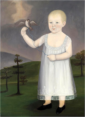
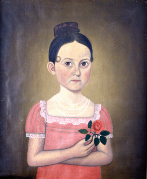
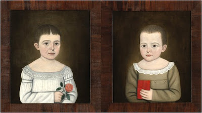
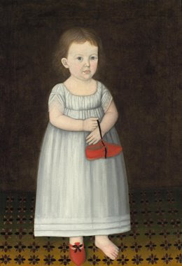
The painter of New England children

(image via nytimes)
Lorelei's great summer reading list for kids got me thinking about my own summer reading plans. Reading for pleasure should be something I am more intentional about and so why not start during these sweltering months when nothing feels as good as a library book in your lap and an iced tea in your hand? I went through a biography binge not too long ago focusing on artists like Diane Arbus and Joseph Cornell so I've decided to start my warm weather reading with another artist's biography: A Deaf Artist in Early America: The Worlds of John Brewster Jr. by Harlan L. Lane.

John Brewster, Jr.
(1766-1854) was a deaf New England painter of portraits. He did portraits of his own family members, other adults and also painted people in pairs, but I like his solitary children. They look serene, yet world-weary. Maybe it's in the seriousness of their eyes or a type of tension in their bodies in having to hold up a rose, a red book, a piece of fruit, a bird by a string.

I'm looking forward to reading this biography and, hey, maybe this will lead to a whole summer of reading without a pencil in my hand, twitching to underline.

"Mary Jane Nowell," 1810-1850

brother-and-sister portraits via nytimes.com

"One Shoe Off," 1810-1850
(image via nytimes)

"Unidentified Boy with Book," 1810

(image via The Florence Griswold Museum)

Monday, June 1, 2009

Hello Gorgeous.

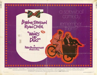
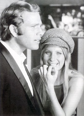
This past weekend I watched "What's Up, Doc?" (1972) a screwball comedy with Barbra Streisand and Ryan O'Neal. I first saw it on tv as a kid and I remember I thought it was just the most hilarious thing I'd ever seen. So I figured it was time for a re-visit. It was cute (I think my humor was much more slapstick-oriented back then), but I totally fall in love with Ms. Streisand all over again.

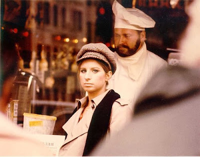
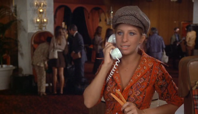
I grew up on her music. My mother has a deep collection of Streisand albums and, even now, I will not miss a television special or skip by any of her songs playing on the radio. "The Way We Were" still destroys me. "Hello, Dolly!" and "Funny Girl" make me plain happy. And so though "What's Up, Doc?" did not have me rolling around in the aisles in quite the same way this time around - Barbra is just beautiful in it. And there's no "despite of" anything - she just exudes coolness and confidence. And I just love her style in this film: the classic trench, the dark blue jeans, the old man cap. So here's a little bit of 70s cool inspiration for the lot of us.
I swear this movie is super light and fun and Streisand smiles endlessly, but this is the only decent image I could find of her very classic trench.

I love the cap and this fitted orange shirt with its wide 70s collar. Such a cool combo.

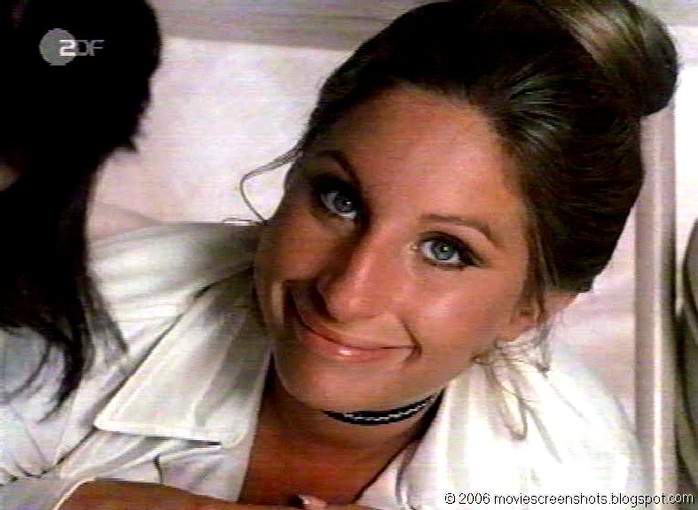
The half smile, golden tan, pile of bubbles and piled up hair.

(image via movie screen shots)
A white pants suit. Under a table. (Where else?)

Her ears poking out of her hair = the most adorable thing ever. Especially in the boy's tank and the delicate gold jewelry (see it in color here).

And can we also notice the make-up? Nude lips, cat eyes. Have I convinced you to rent the movie yet?

LinkWithin

Related Posts with Thumbnails